|
A picture can be worth at least a thousand words, especially when it comes to understanding complicated data. Charts, graphs and maps can be crucial in helping you grasp the underlying information.
“Whether they show COVID-19 cases, global warming trends, high-risk tsunami zones or utility usage, being able to correctly assess and interpret figures allows you to make informed decisions,” writes Boise State University’s Carson MacPherson-Krutsky. She has some tips to help you spot problematic data visualizations – whether they’re sloppily made or intentionally misleading.
South Africa has been in lockdown for four months in a bid to stop the spread of the coronavirus and to save lives. The lockdown has had a devastating effect on people’s jobs and livelihoods, leaving many unable to feed themselves and their families. To cushion the blow, the government announced several social safety measures, including special grants and food distribution programmes. But research by Gabrielle Wills, Leila Patel and Servaas van der Berg shows that the intervention was neither wide nor deep enough to overcome the devastating implications of job and income losses on household food insecurity. They warn of looming mass hunger if efforts to offset the impact of COVID-19 are eased.
|
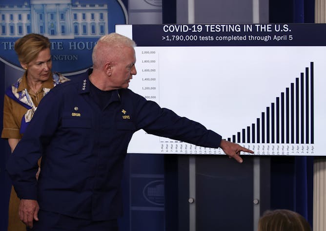
White House Coronavirus Task Force members reference a misleading chart in a press briefing.
AP Photo/Alex Brandon
Carson MacPherson-Krutsky, Boise State University
Visualizations can help you understand data better – but they can also confuse or mislead. Here, some tips on what to watch out for.
|
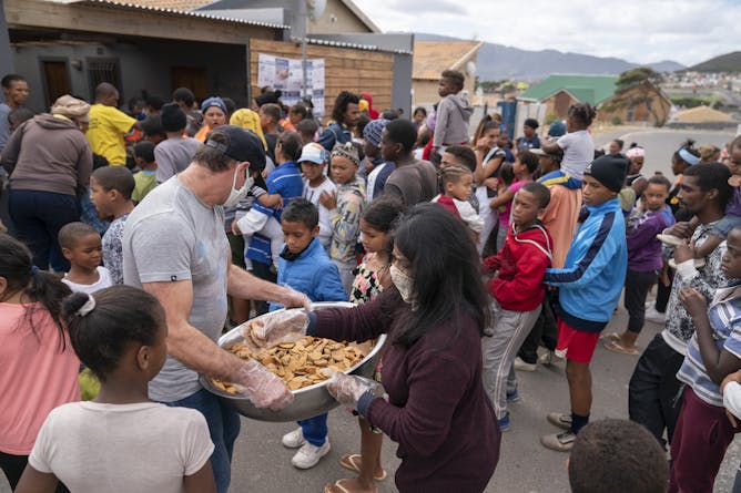
Children receive biscuits and other foods from the Groundbreakers community feeding programme in Ocean View, Cape Town.
EPA-EFE/Nic Bothma
Gabrielle Wills, Stellenbosch University; Leila Patel, University of Johannesburg; Servaas van der Berg, Stellenbosch University
South Africans have experienced significant shocks to their livelihoods, and the threat of hunger presents a major concern for health, political and social stability.
|
Science + Technology
|
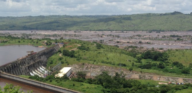
Grace C Wu, University of California, Santa Barbara; Ranjit Deshmukh, University of California, Santa Barbara
A mix of wind, solar photovoltaics, and some natural gas would be more cost-effective than Inga 3 for South Africa and the DRC.
| |

Bryan M.Turner, University of Birmingham; Alice Roberts, University of Birmingham
We can’t tackle the huge global challenges we face in isolation – scientists must be able to work together across borders.
|
|
|